
Tomislav (MSc) has spent more than 15 years in full-stack development and data analysis, but geospatial visualizations are his favorite.
Tomislav (MSc) has spent more than 15 years in full-stack development and data analysis, but geospatial visualizations are his favorite.
Editor’s note: This article was updated on 10/10/22 by our editorial team. It has been modified to include recent sources and to align with our current editorial standards.
If you’re doing anything web related, chances are you’ve heard about Bootstrap. But many developers are still left wondering: “What is Bootstrap used for, specifically?” Here, we’ll examine the basics of Bootstrap and its ideal use cases, including setup, the grid system, and typical component examples.
Bootstrap web development allows programmers to concentrate on development without worrying about design, and get a good looking website up and running quickly. Conversely, it gives web designers a solid foundation for creating interesting Bootstrap themes.
Bootstrap is a powerful toolkit—a collection of HTML, CSS, and JavaScript tools for creating and building web pages and web applications. It is a free and open source project, hosted on GitHub, and originally created by (and for) Twitter.
After its open-source release in 2011, Bootstrap became popular very quickly—and with good reason. Web designers and web developers like Bootstrap because it is flexible and easy to work with. Its main advantages are that it is responsive by design, it maintains broad browser compatibility, it offers consistent design by using reusable components, and it is very quick to learn. It offers rich extensibility using JavaScript, and comes with built-in support for jQuery plugins and a programmatic JavaScript API. Bootstrap can be used with any IDE or editor and any server side technology and language, from ASP.NET to PHP to Ruby on Rails.
Bootstrap is available in two forms: a precompiled version and a source code version. The source code version uses the Less CSS preprocessor, but if you are more into Sass, there is also an official Sass port of Bootstrap. To make it easier to make use of CSS vendor prefixes, Bootstrap uses Autoprefixer.
The source code version comes with styles source code written in Less (or Sass), JavaScript files, and accompanying documentation. This allows more ambitious designers and developers to change and customize all the provided styles as they prefer, and build their own versions of Bootstrap. If you are not familiar with Less (or Sass), or you are not interested in changing the source code, you can use the precompiled vanilla CSS. All the styles can be overridden later by using custom styles.
We’ll focus on the precompiled version, which can be downloaded here. The basic file structure contains two main subfolders, css and js:
| Folder | Contents |
|---|---|
js | Contains bootstrapJavaScript files in various formats. |
css | Contains bootstrap, bootstrap-utilities, bootstrap-reboot, and bootstrap-grid CSS files in various formats. |
The Bootstrap structure is simple and self-explanatory. It includes precompiled files that enable quick use in any web project. Besides compiled and minified CSS and JS files, older versions of Bootstrap also include fonts from Glyphicons and the optional starting Bootstrap theme.
This structure can be easily incorporated in your own project’s file structure by including the Bootstrap files exactly as they come out of the zip archive or, if it suits your project better, you can rearrange these files and place them anywhere you like. Just be sure that the Glyphicons fonts folder is on the same level as the CSS folder.
A basic Bootstrap HTML template should look something like this:
Bootstrap Template
Hello, world!
康爱多皮肤科
德龙咖啡机
365bet体育
365体育
澳门赌场
Sports-betting-contactus@parisairquality.net
Sands-Macao-contactus@lcsmstdq.com
南街村
澳门威尼斯
环特生物
新葡京
God-of-the-sea-feedback@592kcq.com
尚品宅配装修网
三九养生堂
彩票平台
法帝厨房电器官方网站
1518车牌号码吉凶查询网站
New-Portuguese-gambling-help@erweiys.com
麦玲玲官网
河池先锋网
中国模特网
金冠电气
万州人才网
长春欣欣旅游网
中国和家网
胜芳大杂烩
武汉违章查询网
爱武汉社区
爱尚小说网
NeoTV玩家论坛
站点地图
宿迁网
河南机电职业学院
韩国出国留学网
香港贸发局
It is important to start any HTML with an HTML 5 Doctype declaration so that browsers know what kind of a document toexpect. The head contains three important tags that must be declared first, and any additional head tags must be added after these.
JavaScript files are added to the end of the body to allow the web page to load visibly before any JavaScript is executed. jQuery is needed for Bootstrap plugins and needs to load before bootstrap.js. If you aren’t using any of Bootstrap’s interactive features, you can omit these files from the source.
This is the bare minimum needed to get a basic Bootstrap layout up and running. Developers may want to look at more advanced examples on Bootstrap’s examples page. If you’re looking for design inspiration, Bootstrap Expo showcases sites that are built using Bootstrap. As we note later, every part of Bootstrap can be easily customized in CSS. But if that’s not your thing, and you are looking for a slightly different look and feel from the prepackaged Bootstrap themes, there are many free, open source, and premium themes available from Bootswatch and WrapBootstrap.
Before our Bootstrap tutorial dives into components and design templates, it is important to mention one of the major features that Bootstrap introduced in version 3: a mobile-first design philosophy, which yielded a Bootstrap that is responsive by design. This version of Bootstrap easily and efficiently scales with a single code base, from phones and tablets to desktops.
This responsiveness stems from a fluid Bootstrap grid system that can be applied to appropriately scale up to 12 columns, according to the size of the device or viewport. Grids provide structure to layouts, defining the horizontal and vertical guidelines for arranging content and enforcing margins. Grids also offer an intuitive structure for viewers because it’s easy to follow a left-to-right or right-to-left flow of content moving down a page. Before grids—and before CSS was so powerful—grid-based layouts were achieved by using tables, where the content would be arranged inside table cells. As CSS became more mature, a number of CSS frameworks for grid-based layouts started to appear. These include YUI grids, 960 GS and blueprint.
To use the Bootstrap grid system, you must follow certain rules. Grid column elements are placed inside row elements, which create horizontal groups of columns. You can have unlimited rows on the page, but columns must be immediate children of rows. In a full row, the column widths will be any combination that adds up to 12, but it is not mandatory to use all 12 available columns.
Rows need to be placed either in a fixed-width layout wrapper, which has a .container class and a width of 1170px, or in full-width layout wrapper, which has a .container-fluid class and which enables the responsive behavior in that row.
The Bootstrap grid system has four tiers of classes: xs for phones (<768px), sm for tablets (≥768px), md for desktops (≥992px), and lg for larger desktops (≥1200px). These define the sizes at which the columns will collapse or spread horizontally. The class tiers can be used in any combination to get dynamic and flexible layouts.
For example, if we want to get two rows, one with two columns and one with four, we could write:
  First column
  Second column


  First column
  Second column
  Third column
  Fourth column
We can use mixed column widths too:
  Wider column
  Smaller column
We can even shift columns by using offset: for example, to create more narrow and centered content:
Centered column
Columns can be nested. There can be fewer than 12 columns, and as mentioned, we can choose fixed-width or full-width columns by using .container or .container-fluid wrappers, respectively.
      Parent fixed-width column

        Nested column
        Nested column


    Fluid ..
    .. and full-width ..
    .. example
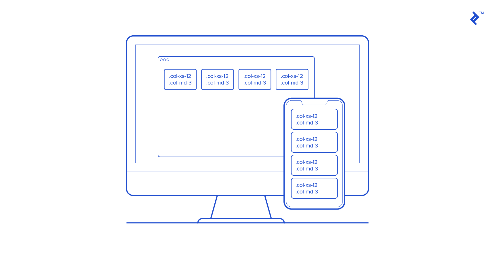
If we combine different class tiers, we will get different looks on mobile and desktop views. In the example below, on the desktop there will be four columns in a line; on mobile, they will have full width and stack on each other.
  .col-xs-12 .col-md-3
  .col-xs-12 .col-md-3
  .col-xs-12 .col-md-3
  .col-xs-12 .col-md-3
It is possible to disable page responsiveness completely on older Bootstrap versions. This will disable the “mobile site” aspects of Bootstrap. Keep in mind that if you disable responsiveness, any fixed-width component, such as a fixed navbar, will not be visible when the viewport becomes narrower than the page content. For a container that is not responsive, that means a width of 970px. Also, in this case, navbars won’t collapse in mobile views, as we’ll describe later.
These are simple examples to demonstrate the basics of Bootstrap. To see the full potential of the grids, check out Bootstrap’s Grids documentation.
We have now answered the question “What is Bootstrap?” Let’s add detailed component examples to our Bootstrap tutorial to see Bootstrap’s improved development experience in action.
Bootstrap comes bundled with basic HTML and CSS design templates that include many common UI components. These include Typography, Tables, Forms, Buttons, Glyphicons, Dropdowns, Buttons and Input Groups, Navigation, Pagination, Labels and Badges, Alerts, Progress Bars, Modals, Tabs, Accordions, Carousels, and many others.
Many of these use JavaScript extensions and jQuery plugins.
These Bootstrap templates are available as well-factored CSS classes that you can apply to HTML to achieve different effects. This makes using Bootstrap convenient. By using semantic class names like .success, .warning and .info, these components are easily reusable and extensible. But while Bootstrap uses descriptive class names that have meaning, it isn’t specific about implementation details. All classes can be overridden with custom CSS style and color, but the meaning of the class will stay the same.
Beginning developers often assume their pure and unstyled HTML will look the same across all browsers. Unfortunately, every browser has its own default “user agent” style sheet applied to the HTML, and no two browsers have the same defaults. For example, heading font sizes are not consistent across browsers, some unordered and ordered lists have left margins and others have left padding, browsers apply custom borders and padding to the HTML body, and buttons render differently across browsers. To address all these inconsistencies, different CSS “reset” rules define consistent style defaults.
Bootstrap brings more goodies to table besides pure CSS reset. It comes with normalize.css, an HTML5-ready alternative to CSS resets, and it also has some well-designed defaults of its own. For example, Bootstrap sets the global default font-size to 14px, with a line-height of 1.428. The default font is changed to Helvetica/Arial, with sans serif fallback. These styles are applied to the and all paragraphs, with the addition that (paragraphs) receive a bottom margin of half their computed line-height (10px by default).
Besides these defaults, customizable styles for standard HTML tags bring more consistency to the text, such as highlighted text (), deleted text (), small text (), and bold text (). Alignment classes help to arrange content on the page more easily by using .text-left, .text-center, .text-right, .text-justify and .text-nowrap classes. There are also predefined styles for block quotes, and unordered and ordered lists, with inline options, to name a few. For a full list, head to the Bootstrap Typography page.
Bootstrap also makes it possible to use, for example, heading styles by using either the tag, or the .h1 class. The latter will match the styling of the heading but will allow the text to be displayed inline.
Forms have come a long way over the years. Today, using a web form is one of the most common activities performed while browsing. While HTML5 introduced a number of new form attributes, input types, and other helper elements, browsers haven’t done much to visually improve forms. This is one area where Bootstrap really shines because aligning and styling labels and inputs, validating forms, and showing error messages can be tricky without some help.
First, Bootstrap sets all textual input elements, like ,